

Rehan: a brand from a letter and a leaf, known before its name is read.
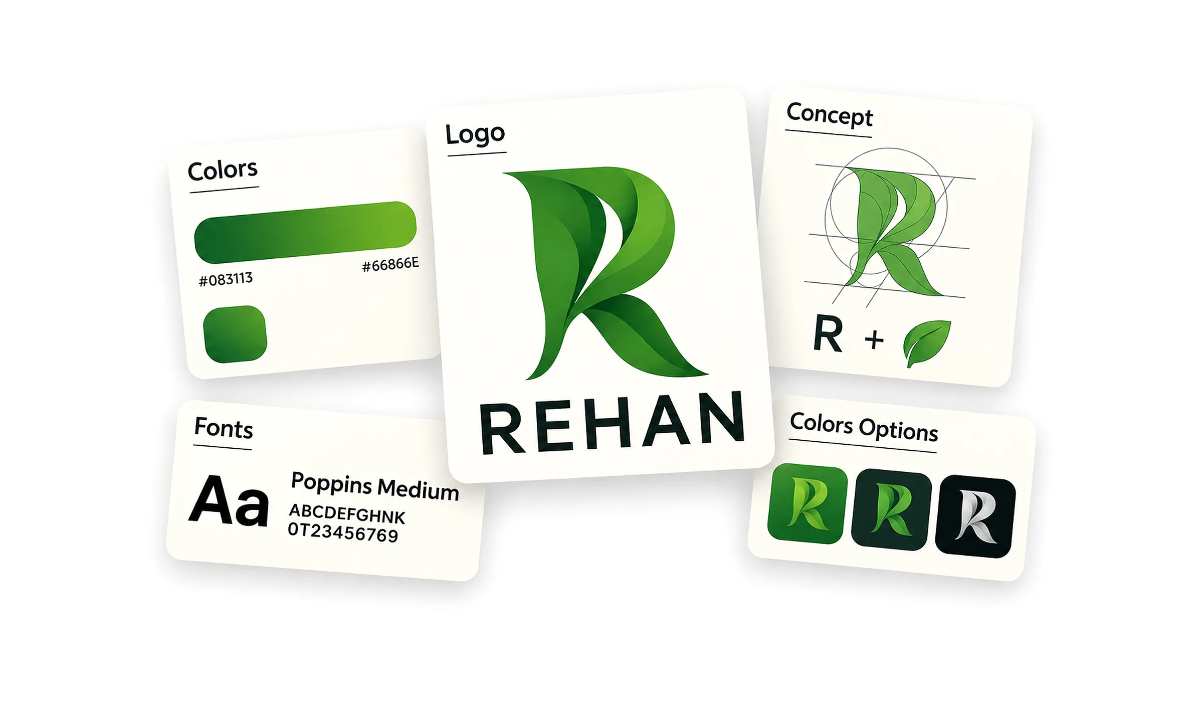
We designed the complete Rehan identity from a single idea: a letter R drawn from the leaves of a plant and built on a grid of circles and lines. The whole brand system grew from that idea: the logo, a two-colour green gradient, a brand typeface and an icon in three versions that works on any background.
The idea
The name is a plant, so that is where we started. We drew the letter R from overlapping leaves on a grid of circles and lines, so the letter and the plant read together at first glance, and the mark stays recognisable on its own when the name is absent: as an app icon, a profile picture or a stamp on packaging.
The brand system
- The logo: the mark, with the word REHAN beneath it in the brand typeface
- A two-colour gradient: #083113 and #66866E
- The brand typeface: Poppins Medium
- The icon in three versions: on green, on dark, and in white on black
- A board explaining the idea and how the letter is built on its grid, for anyone designing for the brand after us
Where it works
The system was built to work wherever the brand appears: the three icon versions keep it clear on light and dark backgrounds, in app stores, on social profiles, and in print and packaging.